top of page


1/3
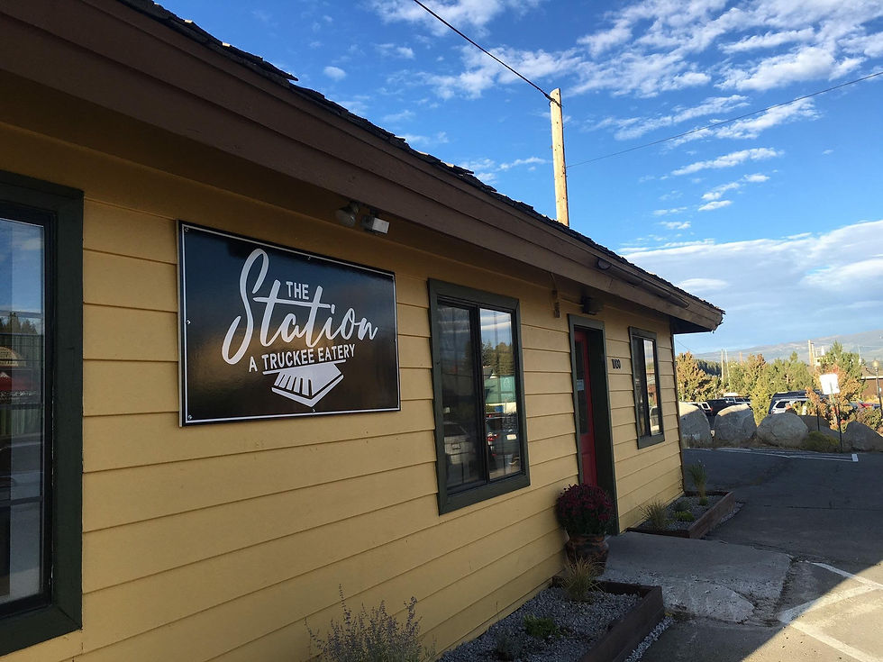
This logo was designed for the owners of a new downtown Truckee eatery, The Station. Our objectives for the logo were for it to be clean and modern, as well as stand out well in black and white or reversed out.
The Station sits right along the Truckee rail line and we were interested in the idea of incorporating a modern feeling with a bit of the area's industrial history. We were able to achieve these goals in the new logo through our mixed font choice, as well as with the basic line-art, and the pilot (or cowcatcher) - quickly suggesting a train, paying a subtle homage to the area's past + present.
WHAT
Logo Design
client
Wrenn Cavallo
WHEN
May 2018
bottom of page